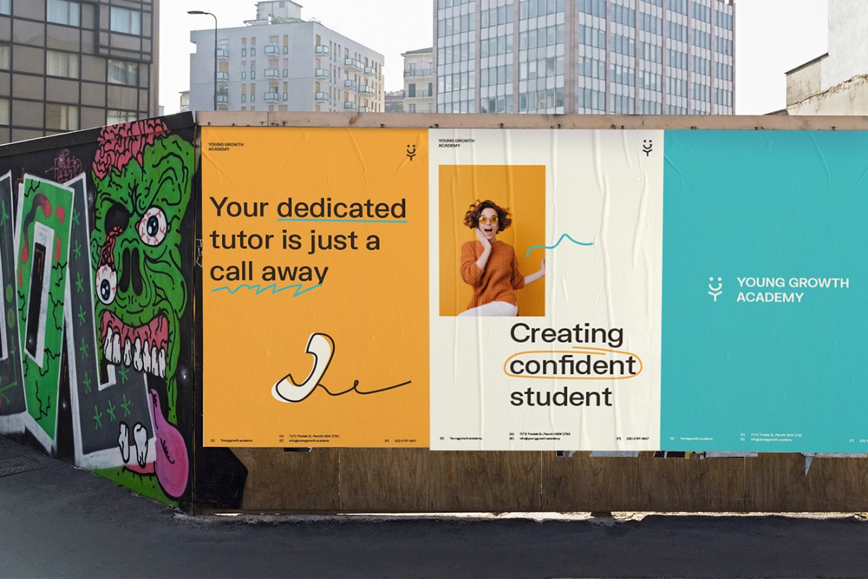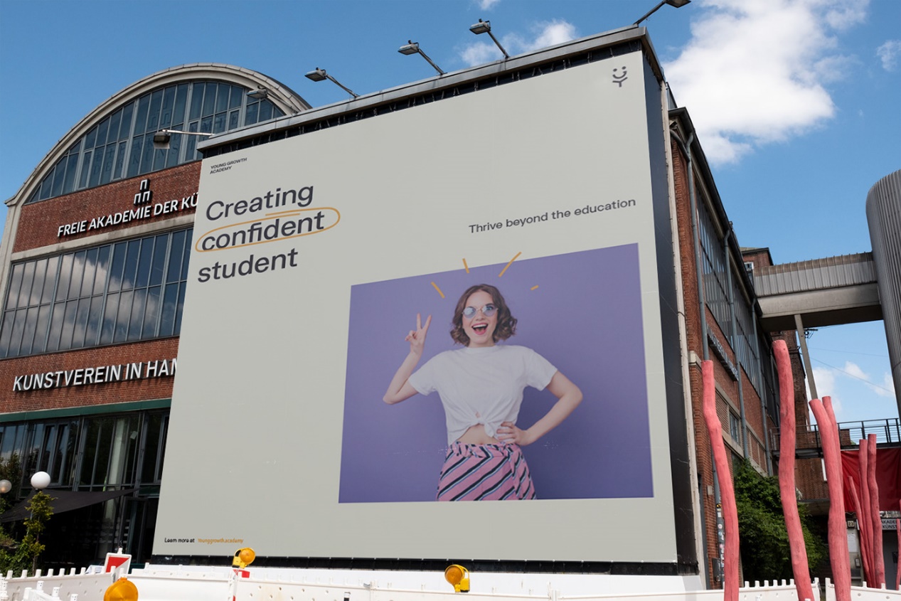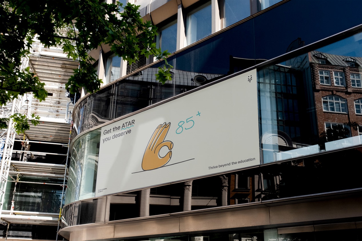
—
Young Growth Academy was founded on three generations of teachers. Their experience and passion for teaching have refined the art and secret of empowering our next generation. While the education system struggles to adapt with a rapidly changing world, they strive to bridge this gap through the four pillars of the Young Growth Academy Teaching Framework.

Concept
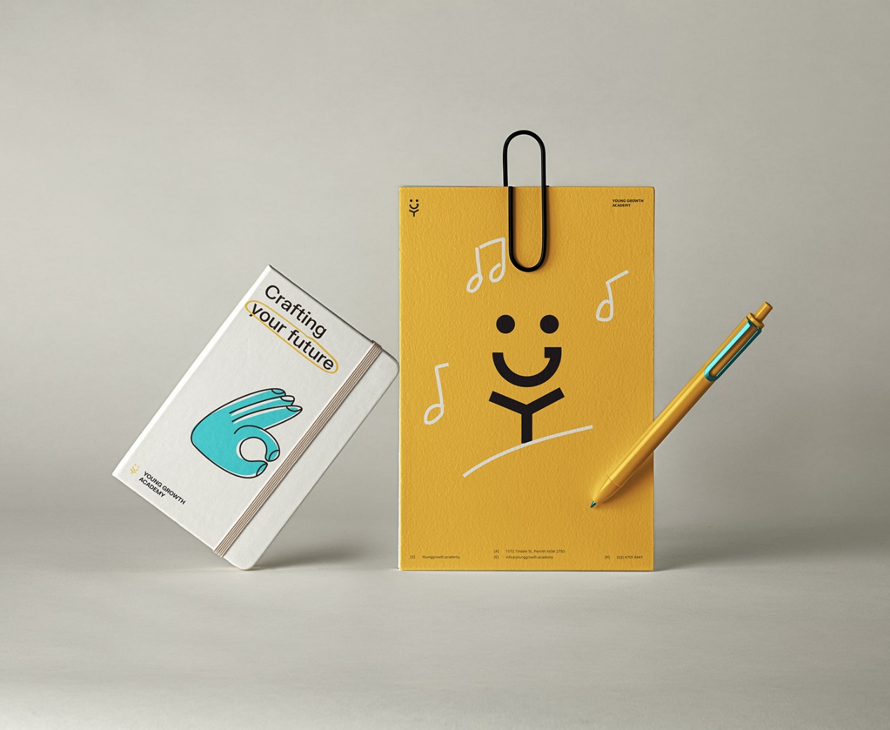
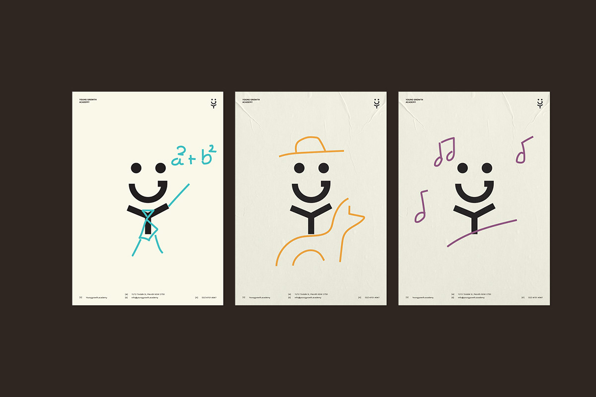
In the process of building the brand, we prioritize in highlighting the idea of every student living up to their dream and vision. Therefore, the Y & G letter stacking together creates a figure that can be personalized by anyone. The concept of this doll emphasizes our idea that anyone can make any dream come true by their very own way.
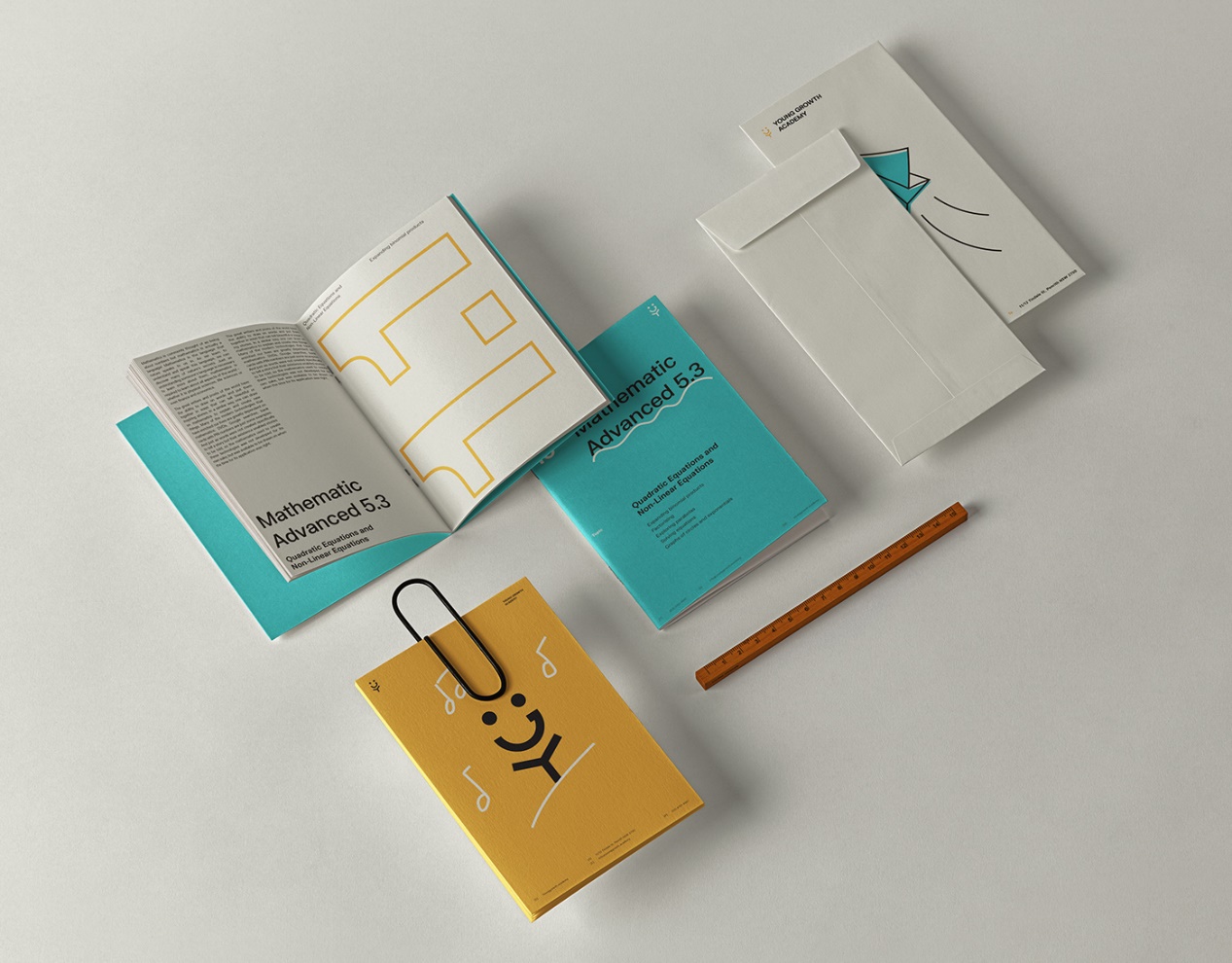
In visualizing whiteboard, mood board or school notes, the branding allows creativity that does not limit YGA to only stick to a visual superstructure when creating artworks. In order to maximize the force in delivering the message of the joy in being creative in their own way to our users, we can flexibly sketch anything stuck to a basic grid with scalable numbers of images. The message to our customers accentuate in emphasizing the delight they will find in the process of creating.
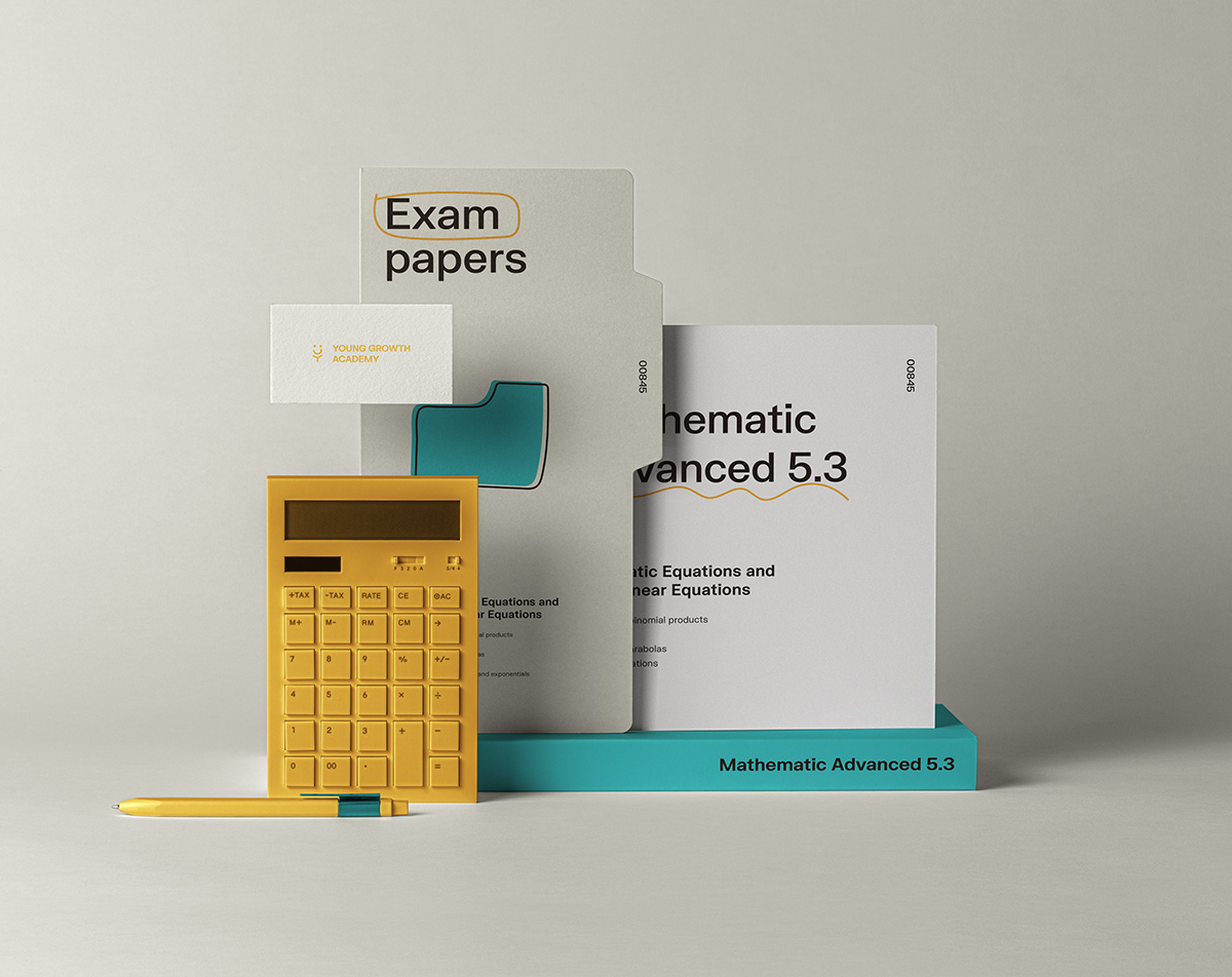
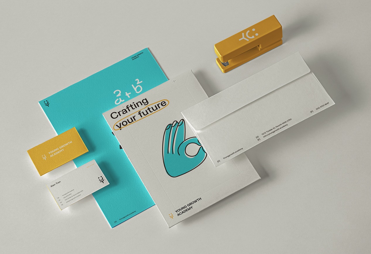
Among the main elements of YGA brand identity, we focus and give prominence to handwritten elements. We believe that a handwritten element creates a human-y look and friendly feel. Handwritten elements also offer the ability of directing the attention to the most parts of the transcript, also participating in adding emotion and pushing the feeling of the message to the image. By given space for creativity, YGA brand identity with handwritten elements shows a brand of free-will, broad-minded and innovative.
